
Restaurant Branding in Tampa: Why Your Logo, Packaging, Menus and Social Should Feel Like One Brand
A guest does not experience your restaurant as separate departments. They see the sign, the menu, the cup, the packaging, the plate and the Instagram feed as one thing. When five different vendors each produce one of those pieces, you end up with five interpretations of the same restaurant, and the brand reads as unfinished even when every individual piece is well made.
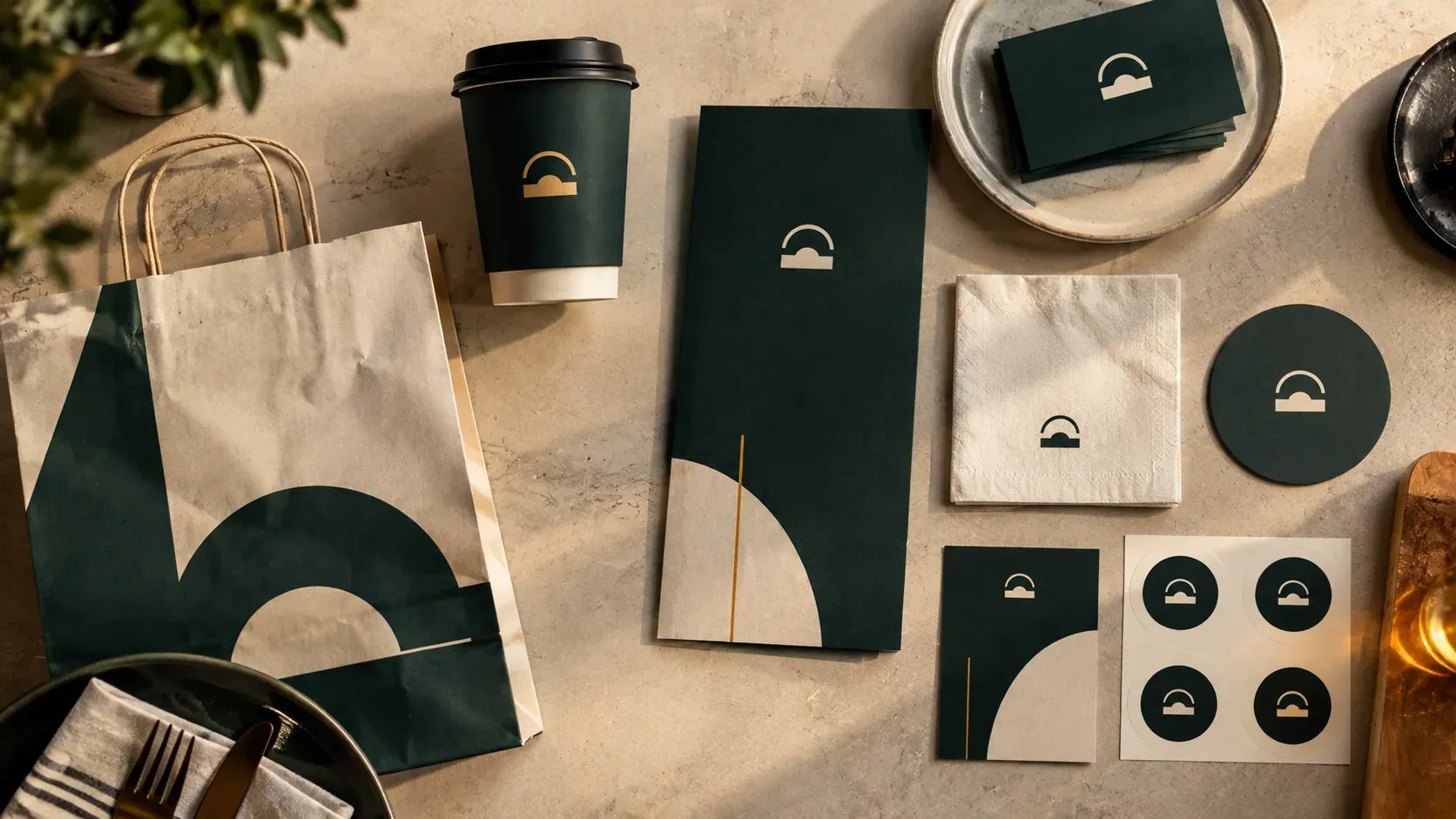
Why should a restaurant's branding feel like one thing?
Because a guest never sees the pieces separately. They see a sign, then a room, then a menu, then a plate, then a takeaway cup, then your Instagram feed a week later. All of that arrives as one impression. When each piece is made by a different person working from a different reference, the impression is of a restaurant that has not decided what it is.
This is the most common branding problem we see, and it is almost never caused by bad work. It is caused by good work made in isolation.
How restaurants end up with five brands
The sequence is nearly always the same, and nobody in it does anything wrong.
A designer on a freelance site makes the logo. It is fine. The packaging supplier has an in-house team who redraw it slightly to fit a cup, because the original file does not work at that size. The menus get made in Canva by whoever has time, using a font that was already installed. Someone's cousin builds the website and picks their own colours because nobody sent a palette. A social media freelancer starts posting, inventing a look from scratch because there is no guide to follow. The interior was designed a year before any of this existed.
Six pieces, six decisions, no single reference. Each one defensible. Together they do not look like one restaurant.
The tell is easy to spot. Put your cup, your menu, your business card and a screenshot of your Instagram grid on a table next to each other. If a stranger could not confidently say they came from the same place, that is the problem, and no individual vendor caused it.
What a guest actually notices
Not the logo. Almost never the logo.
Guests notice consistency, and they notice it as a feeling rather than as a detail. A restaurant where everything matches feels established, considered and safe to spend money in. A restaurant where things do not match feels newer, more improvised and less certain, even when the food is better.
They will not say any of this. Nobody has ever left a review complaining that the takeaway bag used a different green than the sign. But the impression forms anyway, and it shows up in the decisions people make without explaining them: whether they photograph the plate, whether they tag you, whether they come back, whether they recommend you to someone who trusts them.
That is the real cost. Inconsistent branding does not produce complaints. It produces slightly less of everything good.
The pieces that make up a restaurant brand
Worth listing, because most owners think of branding as the first two and then stop.
The identity itself: the logo, the marks, the colours, the typefaces, and the rules for how they go together.
The physical room: signage, wayfinding, the menu boards, the way the space is lit and dressed.
Everything printed: menus, inserts, table cards, receipts, business cards.
Everything disposable: cups, lids, sleeves, bags, boxes, napkins, stickers, cutlery kits. On a takeaway-heavy operation this is the piece a guest handles longest, and it is the piece most often left to whatever the supplier has in stock.
The food itself: how a plate is composed and photographed. Presentation is brand work whether or not anyone treats it that way.
Everything digital: the website, the ordering flow, the Instagram grid, the email that confirms a reservation.
The advertising: what a campaign looks like when it runs, so a paid post reads as yours before anyone reads the caption.
Six or seven categories, usually five or six different suppliers, frequently zero shared reference.
Why Tampa makes this matter more
Tampa's restaurant scene is visually competitive in a way it was not five years ago. There are a lot of good rooms, a lot of good food, and a lot of operators who understand photography and short-form video.
That raises the floor. Being good is table stakes. What separates places now is whether the whole thing hangs together, because a guest deciding between two well-reviewed restaurants on a Friday is choosing on impression, and impression is made of consistency.
It also matters because discovery happens visually here. Someone finds you on Instagram, checks the photos, looks at the Google listing, maybe glances at the website. If those three do not look like the same restaurant, the decision gets harder for no good reason.
The order that actually works
Branding done in the wrong order is how you end up redoing it. The sequence that avoids that:
Strategy first. Who this restaurant is for, what it is, what it is not, and how it should feel. This is a short document, not a deck. It exists so that every later decision has something to check against.
Then identity. Logo, marks, colours, type, and the rules. Delivered as real files that other people can use, not a single JPEG. Most of the drift we see starts here, with a logo delivered as one image file that nobody can adapt, so everybody adapts it themselves.
Then the things people touch. Packaging, menus, signage. These get designed from the identity rather than reinterpreting it.
Then photography and video. Shot to the brand rather than shot and then made to fit. This is also where you build the library that feeds everything else for the next year.
Then social. With a real library to work from, so the feed is an extension of the restaurant instead of a separate project. What makes that content actually convert is its own question.
Then the launch, then the ongoing work. Campaigns that already look like you, because everything above exists.
Each step feeds the next. Skipping one does not save time. It moves the cost later, to the point where something has to be redone.
When you do not need a rebrand
Worth saying, because not every inconsistency is a branding problem.
If your identity is solid and the pieces have simply drifted, you need a brand guide and a tidy-up, not a rebrand. That is a much smaller job. It usually means redrawing the logo properly at every size it has to work at, writing down the colours and type, and then reissuing the pieces that went astray.
A real rebrand is for when the restaurant has changed and the identity has not, or when the identity was never right. The line between the two is worth understanding before you spend anything.
The practical version
If you do nothing else, do this. Gather every branded item you own, physical and digital, and put them in one place. Photograph them together.
You will see immediately which pieces belong and which do not. That photograph is a better brief than most written ones, and it usually makes the priority obvious without anybody arguing about taste.
We do this work end to end as branding, from strategy through identity, packaging, menus, photography and the launch. The reason we do all of it rather than one piece is exactly the problem this article describes.
Questions people ask
What is included in restaurant branding?
More than a logo. It covers brand strategy, the visual identity and its rules, signage and interior wayfinding, printed menus and table pieces, disposable packaging like cups, bags and napkins, food presentation and photography, the website and ordering flow, the social feed, and the advertising. On a takeaway-heavy operation the packaging is the piece guests handle longest.
Why does my restaurant branding look inconsistent?
Usually because each piece was made by a different supplier with no shared reference. A freelancer makes the logo, the packaging supplier redraws it to fit a cup, menus get made in whatever tool is to hand, and a social manager invents a look from scratch. Every decision is defensible on its own, and together they produce several interpretations of the same restaurant.
In what order should restaurant branding be done?
Strategy, then identity, then the physical pieces people touch such as packaging, menus and signage, then photography and video, then social, then the launch and ongoing marketing. Each step feeds the next. Skipping one does not save time, it moves the cost to the point where something has to be redone.
Do I need a full rebrand or just a brand guide?
If the identity is sound and the pieces have simply drifted apart, you need a brand guide and a tidy-up, which is a far smaller job. A full rebrand is for when the restaurant itself has changed and the identity has not kept up, or when the identity was never right in the first place.
Newsletter
Liked this? Get the next one first
New writing on getting found in search and AI answers, restaurant marketing, and the work behind our projects. Only when it’s worth your time.
How we can help
Proof
Keep reading
A logo refresh fixes how the brand looks. A rebrand fixes what the brand means — its positioning, its voice, the story it tells. If customers still understand what you do and just think the visuals feel dated, refresh. If the business has genuinely changed and the old identity no longer fits, that's a rebrand.
Top 7 Food Influencers in Tampa Bay, Orlando and Nearby Areas for Restaurant MarketingOur seven picks for restaurant influencer partnerships in Tampa Bay and Orlando are Food by Tiana, Tasty Chomps, Jesus Andres Andrade, Bin Min Munch, Michael Haffner, Mr. Tampa Bay and Your Tampa Bestie — chosen for local trust, thoughtful content and how their audiences actually respond, not follower counts.
Custom Website vs. Wix, Squarespace or WordPress: What Should a Growing Business Choose?There is no single right platform. Squarespace and Wix are genuinely good choices for a small site that rarely changes. WordPress suits content-heavy sites with a maintainer. A custom build earns its cost when the site is a working part of the business rather than a brochure, and when speed, structure or integrations start deciding revenue.